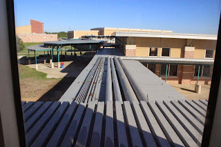
This photo of the ceiling was a unique perspective.
The pipes and lines of the sheet metal on the awnings were leading lines. It carried my eyes out towards the cafeteria
The way that the light separated the tiles and cast a shadow on one and made the other lighter seemed like good Contrast.
Our shadows to me were balanced together.
The repetition of the arrows shades in the wood door drew my eye.
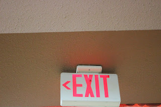
The simple exit sign.
I chose this as my rule of thirds because the purple among the green really draws a triangle pattern.


No comments:
Post a Comment